
Last week, Julia Belluz of Vox argued that people inefficiently donate money to charity. Rather than directing donations towards fighting the diseases that ravage the most people, we give money for less pragmatic reasons. For instance, someone might donate to a charity in order to honor a family member killed by a certain disease. While commemorating someone with a donation is reasonable, Belluz believes allowing our donations to be influenced by celebrities and viral marketing campaigns is not.
Belluz points to the Ice Bucket Challenge as an example of how good publicity can attract more money than actual death tolls. To show this, the article includes this bubble chart that displays the number of people killed by eight diseases on the right side and the amount of money raised by fundraisers associated with those same diseases on the left. It purports to show how the ALS Association has raised more money than other fundraisers, despite the fact that motor-neuron diseases like ALS kill comparatively fewer people. As of today, this bubble chart has been shared over 7,000 times on Facebook. It’s unfortunate then that though the numbers presented in the chart are accurate, the way the data is displayed is not. I reveal why below and explain how my scatter plot above displays the data more honestly.
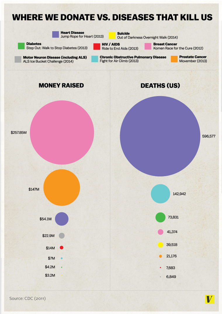

The major problem with Vox’s bubble chart is that it attempts to scale each circle by adjusting its diameter. However, this exaggerates the degree of change in the actual numerical values shown on the chart because by adjusting a circle’s diameter, it does not proportionally change its area. For example, the big pink circle represents a value of $257.85 million, which means it should be 1.75 times bigger than the orange circle below it. But as we see in the chart above, we could fit at least two orange circles inside the pink circle. By adjusting the diameter of each circle and not its area, the pink circle is nearly twice as large as it should be. This error repeats itself throughout the graphic.
However, even if the data was displayed correctly, it should not have been presented in the form of a bubble chart. In fact, it’s rarely a good idea to use a bubble chart to visualize data — especially if you’re trying to show the relationship between two variables. Edward Tufte clarifies why in his book “The Visual Display of Quantitative Information.” In it, he stated:
The use of two (or three) varying dimensions to show one-dimensional data is a weak and inefficient technique, capable of handling only very small data sets, often with error in design and ambiguity in perception. These designs cause so many problems that they should be avoided.
Kaiser Fung, adjunct professor of statistics at NYU, agrees with Tufte, writing on his blog Junk Charts that the bubble chart is “one of the most hopeless data graphics ever invented.”
So with that in mind, I decided to redesign Vox’s chart. I chose a scatter plot because it clearly shows how skewed donations are to some charities when we consider how many people die from those diseases. Along the x-axis, I plotted the total number of deaths caused by the eight diseases examined by Vox. We immediately see how many more Americans heart disease kills than the other 7 diseases combined, yet Jump Rope For Heart — a fundraiser put on by the American Heart Association — raises substantially less money than either breast or prostate cancer charities. On the left side of the x-axis, you’ll find motor-neuron diseases, which kills the fewest people each year among these eight diseases. But thanks to the success of the Ice Bucket Challenge, it’s now the disease with the fourth most successful fundraiser.
The point Belluz tries to make in her piece is a noble one: that we should donate more money to charities that benefit the most people and do so efficiently. Regrettably, this point is lost in the poorly designed chart that accompanies her thoughtful piece.
Update: I’d like to thank the great Alberto Cairo for tweeting about this post.